

Your business signage is one of the most important marketing tools at your disposal. It’s the first thing that customers see when they visit your establishment, and it plays a crucial role in shaping their perception of your brand. One of the most important aspects of creating effective signage is choosing the right font. The right font can make your message stand out and make your brand more memorable, while the wrong font can have the opposite effect. In this article, we’ll go over some tips for choosing the right font for your signage.
Contents
Consider your brand identity
The font you choose for your signage should be consistent with your brand identity. Think about the message you want to convey and the emotions you want to evoke. If you run a daycare center, for example, you might want to choose a playful and fun font to convey a sense of warmth and friendliness. On the other hand, if you run a law firm, you might want to choose a more serious and professional font to convey a sense of trust and credibility.
Keep it simple
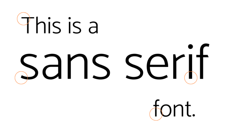
When it comes to signage, simpler is often better. A clean, simple font is easier to read from a distance and can be more visually appealing than a busy, ornate font. Avoid fonts with too many flourishes, as these can be difficult to read from a distance.
Consider legibility
Legibility is perhaps the most important factor to consider when choosing a font for your signage. Your font should be easy to read, even from a distance. Avoid fonts with a lot of detail, as these can be difficult to read from far away. Additionally, choose a font that has a high level of contrast between the letters and the background. A font that blends in with the background can be difficult to read, even up close.
Think about scalability
Your signage will likely be displayed at a variety of different sizes, from small signs to large billboards. Make sure the font you choose is scalable and remains legible at all sizes. A font that looks great on a small sign may be difficult to read when blown up to billboard size.
Consider the context
The context in which your signage will be displayed should also be taken into consideration when choosing a font. If your sign will be displayed outdoors, for example, you might want to choose a font that is bold and easy to read from a distance. If your sign will be displayed in an upscale shopping mall, on the other hand, you might want to choose a more elegant and refined font to fit the context.
Get a second opinion
Finally, don’t be afraid to get a second opinion. Show your font choices to others and ask for their feedback. What may look great to you may not be as effective for your target audience. Getting a second opinion can help you make a more informed decision.
Conclusion
Choosing the right font for your signage is an important decision that can have a big impact on the success of your marketing efforts. By considering your brand identity, keeping it simple, considering legibility, thinking about scalability, considering the context, and getting a second opinion, you can make an informed decision that will help your business stand out and be more memorable.
